Progress Bar Skill bisa jadi elemen visual yang estetik dan informatif untuk mempercantik tampilan portofolio kamu. Salah satu cara keren untuk menampilkan kemampuan di berbagai bidang seperti HTML, CSS, desain grafis, atau pengembangan web. Dengan progress bar, profil kamu bakal terlihat lebih profesional dan menarik!
Ini yang saya gunakan di profil (wordpress) dan ini demo di blogspot. Kode ini bisa kamu gunakan di wordpress dan blogspot.
Nah, kali ini kita akan bikin progress bar tanpa JavaScript, cukup dengan HTML dan CSS (inline style). Simpel, ringan, dan tetap stylish!
Struktur Dasar HTML Progress Bar Skill
Pertama, kita buat struktur HTML-nya. Kita akan gunakan elemen <div> dan <span> untuk membuat barisan skill.
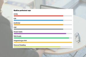
<div style="display: flex; flex-direction: column; gap: 1rem;">
    <div style="margin-bottom: 0.5rem;">
        <span style="font-size: 16px; font-weight: bold;">HTML</span>
        <div style="background: #ddd; height: 12px; border-radius: 6px; margin-top: 4px;">
            <div style="width: 85%; background: #e74c3c; height: 100%; border-radius: 6px;"></div>
        </div>
    </div>
    <div style="margin-bottom: 0.5rem;">
        <span style="font-size: 16px; font-weight: bold;">CSS</span>
        <div style="background: #ddd; height: 12px; border-radius: 6px; margin-top: 4px;">
            <div style="width: 85%; background: #3498db; height: 100%; border-radius: 6px;"></div>
        </div>
    </div>
    <div style="margin-bottom: 0.5rem;">
        <span style="font-size: 16px; font-weight: bold;">JavaScript</span>
        <div style="background: #ddd; height: 12px; border-radius: 6px; margin-top: 4px;">
            <div style="width: 85%; background: #f39c12; height: 100%; border-radius: 6px;"></div>
        </div>
    </div>
    <div style="margin-bottom: 0.5rem;">
        <span style="font-size: 16px; font-weight: bold;">PHP</span>
        <div style="background: #ddd; height: 12px; border-radius: 6px; margin-top: 4px;">
            <div style="width: 85%; background: #7f8c8d; height: 100%; border-radius: 6px;"></div>
        </div>
    </div>
    <div style="margin-bottom: 0.5rem;">
        <span style="font-size: 16px; font-weight: bold;">Desain Grafis</span>
        <div style="background: #ddd; height: 12px; border-radius: 6px; margin-top: 4px;">
            <div style="width: 90%; background: #8e44ad; height: 100%; border-radius: 6px;"></div>
        </div>
    </div>
    <div style="margin-bottom: 0.5rem;">
        <span style="font-size: 16px; font-weight: bold;">Web Desain</span>
        <div style="background: #ddd; height: 12px; border-radius: 6px; margin-top: 4px;">
            <div style="width: 95%; background: #2ecc71; height: 100%; border-radius: 6px;"></div>
        </div>
    </div>
    <div style="margin-bottom: 0.5rem;">
        <span style="font-size: 16px; font-weight: bold;">Pengembangan Web</span>
        <div style="background: #FFBD2F; height: 12px; border-radius: 6px; margin-top: 4px;">
            <div style="width: 97%; background: #FFBD2F; height: 100%; border-radius: 6px;"></div>
        </div>
    </div>
    <div style="margin-bottom: 0.5rem;">
        <span style="font-size: 16px; font-weight: bold;">Personal Branding</span>
        <div style="background: #ddd; height: 12px; border-radius: 6px; margin-top: 4px;">
            <div style="width: 80%; background: #D1DE56; height: 100%; border-radius: 6px;"></div>
        </div>
    </div>
</div>Contoh Tampilan 1
Penjelasan Kode Progress Bar Skill
display: flex; flex-direction: column;: Mengatur elemen agar tersusun ke bawah (kolom).gap: 1rem;: Memberikan jarak antar item skill.width: 85%: Menentukan seberapa “mahir” kamu di skill tersebut.background: #e74c3c;: Warna dari progress bar. Bisa kamu ganti sesuai selera.
Tips Tambahan
- Ubah nilai
widthuntuk mencerminkan tingkat kemampuanmu (misalnya: 90%, 75%, 60%). - Gunakan warna yang berbeda untuk tiap skill biar tampilannya lebih hidup.
Kalau kamu ingin tampil lebih profesional, kamu bisa memindahkan style ke file CSS terpisah. Tapi untuk demo cepat atau portofolio statis, versi inline ini udah cukup cakep! Selamat mencoba. Jika ingin modifikasi atau ingin kode html tulis di kolom komentar yaa.
Hasil Modifikasi (lanjutan)
<div style="width: 80%; margin: auto; font-family: 'Segoe UI', Tahoma, Geneva, Verdana, sans-serif;">
    <div style="display: flex; flex-direction: column; gap: 1rem;">
        <!-- HTML -->
        <div>
            <div style="display: flex; justify-content: space-between; margin-bottom: 4px;">
                <span style="font-weight: 600; color: #333;">HTML</span>
                <span style="font-weight: 500; color: #e74c3c;">85%</span>
            </div>
            <div style="background: #f1f1f1; height: 10px; border-radius: 5px; overflow: hidden; box-shadow: inset 0 1px 3px rgba(0,0,0,0.1);">
                <div style="width: 85%; background: linear-gradient(90deg, #e74c3c, #c0392b); height: 100%; border-radius: 5px; transition: width 1s ease-in-out;"></div>
            </div>
        </div>

        <!-- CSS -->
        <div>
            <div style="display: flex; justify-content: space-between; margin-bottom: 4px;">
                <span style="font-weight: 600; color: #333;">CSS</span>
                <span style="font-weight: 500; color: #3498db;">85%</span>
            </div>
            <div style="background: #f1f1f1; height: 10px; border-radius: 5px; overflow: hidden; box-shadow: inset 0 1px 3px rgba(0,0,0,0.1);">
                <div style="width: 85%; background: linear-gradient(90deg, #3498db, #2980b9); height: 100%; border-radius: 5px; transition: width 1s ease-in-out;"></div>
            </div>
        </div>

        <!-- JavaScript -->
        <div>
            <div style="display: flex; justify-content: space-between; margin-bottom: 4px;">
                <span style="font-weight: 600; color: #333;">JavaScript</span>
                <span style="font-weight: 500; color: #f39c12;">85%</span>
            </div>
            <div style="background: #f1f1f1; height: 10px; border-radius: 5px; overflow: hidden; box-shadow: inset 0 1px 3px rgba(0,0,0,0.1);">
                <div style="width: 85%; background: linear-gradient(90deg, #f39c12, #e67e22); height: 100%; border-radius: 5px; transition: width 1s ease-in-out;"></div>
            </div>
        </div>

        <!-- PHP -->
        <div>
            <div style="display: flex; justify-content: space-between; margin-bottom: 4px;">
                <span style="font-weight: 600; color: #333;">PHP</span>
                <span style="font-weight: 500; color: #7f8c8d;">85%</span>
            </div>
            <div style="background: #f1f1f1; height: 10px; border-radius: 5px; overflow: hidden; box-shadow: inset 0 1px 3px rgba(0,0,0,0.1);">
                <div style="width: 85%; background: linear-gradient(90deg, #7f8c8d, #34495e); height: 100%; border-radius: 5px; transition: width 1s ease-in-out;"></div>
            </div>
        </div>

        <!-- Desain Grafis -->
        <div>
            <div style="display: flex; justify-content: space-between; margin-bottom: 4px;">
                <span style="font-weight: 600; color: #333;">Desain Grafis</span>
                <span style="font-weight: 500; color: #8e44ad;">90%</span>
            </div>
            <div style="background: #f1f1f1; height: 10px; border-radius: 5px; overflow: hidden; box-shadow: inset 0 1px 3px rgba(0,0,0,0.1);">
                <div style="width: 90%; background: linear-gradient(90deg, #8e44ad, #9b59b6); height: 100%; border-radius: 5px; transition: width 1s ease-in-out;"></div>
            </div>
        </div>

        <!-- Web Desain -->
        <div>
            <div style="display: flex; justify-content: space-between; margin-bottom: 4px;">
                <span style="font-weight: 600; color: #333;">Web Desain</span>
                <span style="font-weight: 500; color: #2ecc71;">95%</span>
            </div>
            <div style="background: #f1f1f1; height: 10px; border-radius: 5px; overflow: hidden; box-shadow: inset 0 1px 3px rgba(0,0,0,0.1);">
                <div style="width: 95%; background: linear-gradient(90deg, #2ecc71, #27ae60); height: 100%; border-radius: 5px; transition: width 1s ease-in-out;"></div>
            </div>
        </div>

        <!-- Pengembangan Web -->
        <div>
            <div style="display: flex; justify-content: space-between; margin-bottom: 4px;">
                <span style="font-weight: 600; color: #333;">Pengembangan Web</span>
                <span style="font-weight: 500; color: #FFBD2F;">97%</span>
            </div>
            <div style="background: #f1f1f1; height: 10px; border-radius: 5px; overflow: hidden; box-shadow: inset 0 1px 3px rgba(0,0,0,0.1);">
                <div style="width: 97%; background: linear-gradient(90deg, #FFBD2F, #FFA500); height: 100%; border-radius: 5px; transition: width 1s ease-in-out;"></div>
            </div>
        </div>

        <!-- Personal Branding -->
        <div>
            <div style="display: flex; justify-content: space-between; margin-bottom: 4px;">
                <span style="font-weight: 600; color: #333;">Personal Branding</span>
                <span style="font-weight: 500; color: #D1DE56;">80%</span>
            </div>
            <div style="background: #f1f1f1; height: 10px; border-radius: 5px; overflow: hidden; box-shadow: inset 0 1px 3px rgba(0,0,0,0.1);">
                <div style="width: 80%; background: linear-gradient(90deg, #D1DE56, #A3C14A); height: 100%; border-radius: 5px; transition: width 1s ease-in-out;"></div>
            </div>
        </div>
    </div>
</div>Contoh Tampilan 2
*update artikel, 24 April 2025
Satu pemikiran pada “Kode HTML Progress Bar Skill untuk WordPress dan Blogspot”